2007
Catalogue & Font
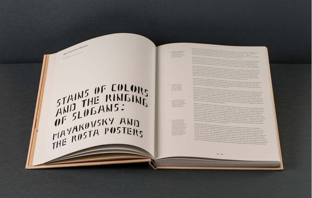
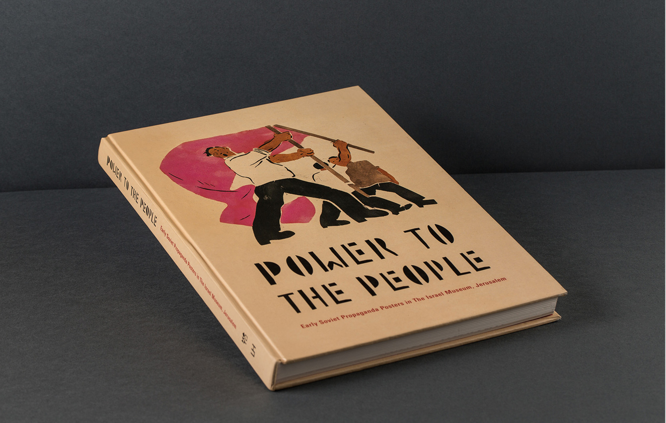
Font and catalog design for the exhibition Power to The People at The Israel Museum, Jerusalem (curated by Alex Ward).
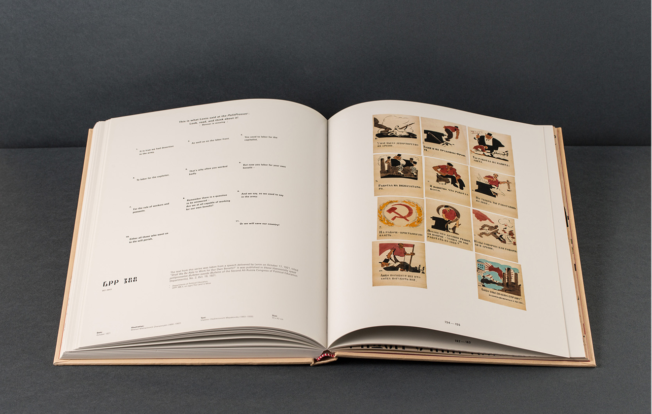
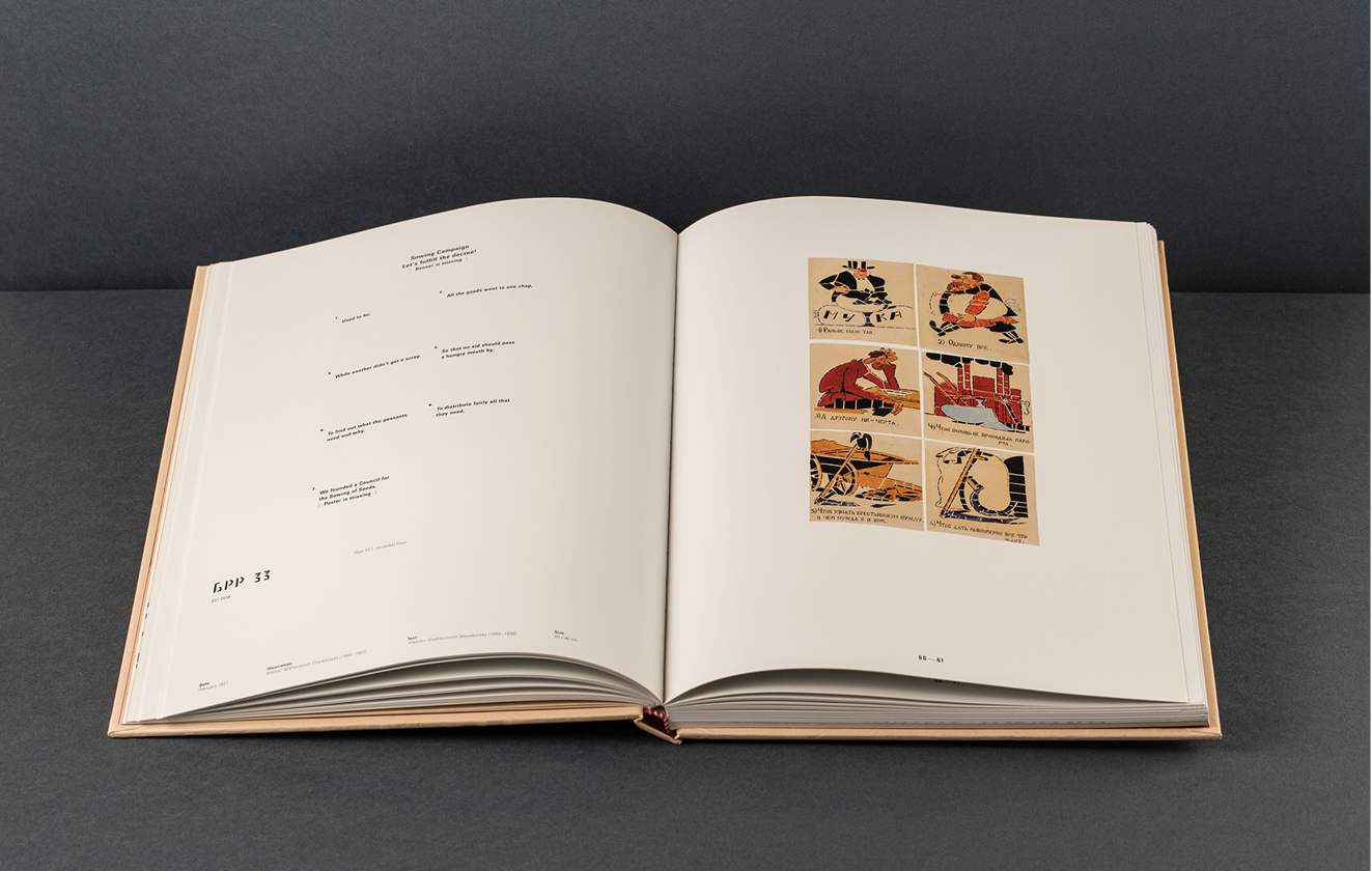
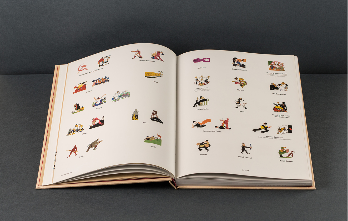
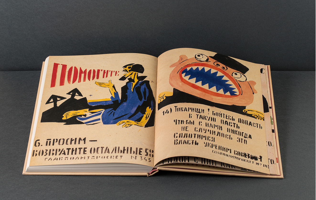
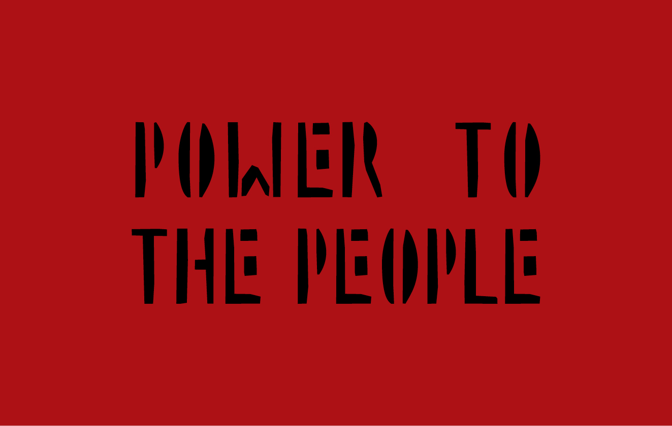
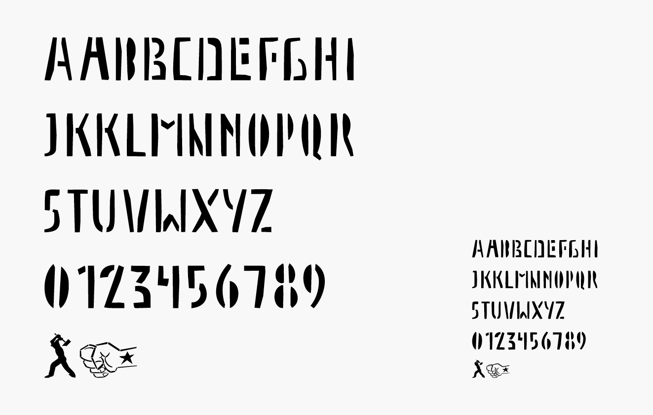
Power to the People presents the Israel Museum's major collection of propaganda posters from the early years of the Soviet Union, documenting one of the most interesting chapters in twentieth-century graphic design. The teams of artists and writers who collectively produced the propaganda posters were inspired by the traditional vernacular of political cartoons, by the lubok wood-cut technique of Russian folk art, and by the ideas of Futurism (most poetry by avant-garde poet and artist Vladimir Mayakovsky). They combined text and illustration to comment on social and political issues of the day in an indirect or allegorical manner. The most dominant figure was the, who in addition to creating many of the images was responsible for the majority of the written texts. The book format was the result of the original posters format and the catalogue layout was based on the posters original layout were the text was at the bottom and the image at the top. In the catalogue the headlines are at the bottom ant the images/text are at the top. The font "Rosta" was based on the typeface from the original stencils and its used in the whole catalogue.
[ The Israel Museum, Jerusalem & Lund Humphries Publishers ]
